
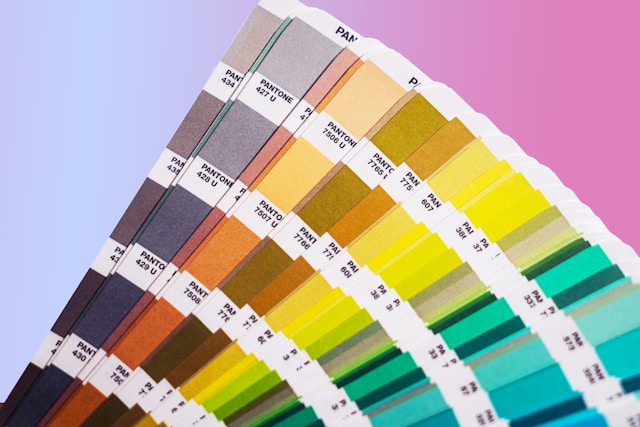
The Impact of Screen Technology on Color Perception
As online shopping for construction materials and furniture becomes more popular, understanding how screen technology affects color perception has become increasingly important. Each type of display technology—from LCD to OLED—interprets colors differently, impacting how users perceive materials like paint, fabric, metal, and wood online. Coupled with individual screen settings and diverse lighting conditions, these variations make achieving accurate color representation challenging, especially for materials with unique textures or finishes.
1. Variations in Display Technologies (LCD, LED, OLED)
LCD (Liquid Crystal Display): LCD screens are widely used in desktops, laptops, and some tablets. They tend to have consistent brightness levels but generally lack the deep contrast and rich colors that OLED screens can produce. Colors on LCDs can appear slightly washed out, especially when viewed from an angle, which can make it difficult for users to perceive true color depth. This is particularly relevant for materials like wood and fabric, where subtle color variations are essential.
LED (Light Emitting Diode): LED screens are a type of LCD that uses LED backlighting for improved brightness and contrast compared to traditional LCDs. LED displays provide sharper images and more vibrant colors than standard LCDs but still cannot achieve the deep blacks or intense saturation levels that OLED screens offer. LED screens are widely used in many smartphones and tablets, providing better color accuracy than basic LCDs, yet may still fall short in representing nuanced colors, especially under high brightness settings.
OLED (Organic Light Emitting Diode): OLED screens are known for their high color accuracy, deep blacks, and ability to display vibrant colors. OLED technology allows each pixel to emit its own light, creating sharper contrast and richer colors than LCDs or LED displays. This is beneficial for viewing images with deep shadows and subtle color transitions, but it can make colors appear more saturated than they would in real life. For example, a fabric swatch viewed on an OLED screen might look richer or more intense than it does in person, potentially leading to a misleading sense of the fabric's actual color.
Each of these display technologies interprets colors in unique ways, and their color accuracy is often influenced by factors like screen size and viewing angle. For online shoppers, this means that the same color can look subtly different from one device to another, complicating the process of selecting materials that rely on precise color representation.
2. The Role of Screen Calibration and User Settings
Screen Calibration: Calibration settings for brightness, contrast, and color balance vary widely across devices and users, and these adjustments can significantly impact color perception. Professional monitors are often calibrated to ensure that colors display accurately, especially for designers and photographers who rely on color precision. However, most consumers don't calibrate their devices, leading to inconsistent color representation. For instance, a customer with an uncalibrated screen may see a warm beige appear more yellow, or a dark green appear nearly black, potentially resulting in mismatched expectations upon receiving the physical product.
User Preferences: Many users adjust screen settings based on personal preferences or environmental lighting, which can unintentionally alter color perception. Increasing brightness can wash out colors, while reducing it might make colors appear more intense or shadowed. Users may also adjust settings to enhance contrast, which can alter how subtle color variations are perceived—particularly for complex materials like wood grains or textured fabrics.
Automatic Screen Adjustments: Some devices, particularly newer smartphones and laptops, automatically adjust brightness and color temperature based on ambient lighting conditions. While this feature improves visibility, it can distort how colors are displayed. For example, Apple's "True Tone" feature adjusts display colors based on the lighting environment, which can shift how a user perceives colors indoors versus outdoors.
3. Influence of Lighting Environments on Screen Color Perception
Natural Light vs. Artificial Light: Ambient lighting plays a significant role in how colors appear on digital screens. Natural light, which changes in color temperature throughout the day, can cause materials to look cooler in the morning and warmer in the afternoon. Artificial lighting varies based on bulb type—warm incandescent bulbs versus cooler LED lights—and can alter color perception on a screen. For example, a soft gray viewed under warm indoor lighting may look warmer, even slightly beige, compared to how it would appear under natural daylight.
Direct vs. Indirect Lighting: Viewing screens under direct lighting (such as sunlight or overhead lighting) can create glare, reducing contrast and making colors appear washed out. Conversely, indirect lighting can enhance contrast, often making colors appear deeper or more saturated. For online shoppers viewing materials like fabric or paint, this variation can make it challenging to gauge the true appearance of a color.
Viewing Angle and Distance: LCD screens, in particular, suffer from color distortion when viewed at an angle. A color that appears vibrant when viewed head-on may look washed out from the side. While OLED screens tend to maintain color integrity better across angles, viewing angle and distance still impact color perception across all devices, especially when assessing fine details or subtle hues.
4. Limitations of Digital Color Representations (RGB and Hex Codes)

RGB (Red, Green, Blue) Color Model: RGB is an additive color model used to display colors on screens, combining red, green, and blue light to create various hues. However, RGB does not capture the depth and nuance of colors as seen on physical materials, particularly those with complex finishes or textures. For example, an RGB representation of a metallic gold finish might look flat on a screen, lacking the sheen and depth found in real life.
Hex Codes: Hexadecimal color codes are a digital standard for web design, translating RGB values into a code that defines a specific color on websites and applications. While hex codes are convenient for representing color digitally, they do not accurately capture variations in texture, finish, or light reflection that exist in physical materials. A hex code for "dark blue" may accurately show the intended color on a screen, but it won't reflect the sheen of a satin fabric or the slight undertones of a wood grain.
Limited Gamut of Digital Displays: RGB and hex representations are limited to the color gamut (range) that each display can reproduce. Physical materials often contain colors outside of this digital gamut, particularly when they have complex reflective or absorptive qualities. As a result, materials like metallic paints, highly pigmented fabrics, and natural stones may contain color variations that can't be represented digitally, even with high-quality displays.
Reliance on RGB and hex codes for digital color representation can make it challenging for online shoppers to understand the full complexity of a color in its physical form. In a digital context, colors may appear less vibrant, lack texture, and fail to showcase the true depth or finish that a customer would see in person. For materials like metal and wood, which rely heavily on light interaction to reveal their full color character, digital representations often fall short of providing an accurate preview.
In summary, the nuances of screen technology—from display type to individual calibration and lighting conditions—significantly impact how colors are perceived in an online shopping setting. While RGB and hex codes provide a functional standard for color representation, they lack the ability to capture the subtle qualities of physical materials that play a crucial role in design and architecture. These challenges highlight the importance of supplementary tools and solutions that can help bridge the gap between digital representation and real-world color experience, enabling customers to make more informed decisions in a visually consistent manner. While understanding how screen technology affects color perception is essential, it's equally important to know how to overcome these challenges. In our next article, "Solutions for Overcoming Online Color Matching Challenges," we'll explore practical strategies and advanced tools that designers and homeowners can use to achieve accurate color representation when sourcing materials online. Discover how to bridge the gap, ensuring your projects maintain their intended aesthetic harmony.
Recent Posts

How To Achieve a 20% Reduction in Construction Costs Through More Efficient Source Procurement
Managing Customer Expectations: Enhancing Trust in Online Color Selection
Solutions for Overcoming Online Color Matching Challenges
The Impact of Screen Technology on Color Perception

Understanding the Color Matching Dilemma
Overcoming Colour Matching Challenges in the Digital Age: Insights for Architects and Interior Designers

4 Reasons Why Construction Service Providers Should Join an Online Marketplace